Color isn’t just a visual element; it’s a powerful tool that can sway emotions and drive decisions. When you land on a website, the colors surrounding you can evoke feelings of trust, excitement, or even anxiety. Imagine walking into a room painted in calming blues versus one drenched in fiery reds. Each hue tells a story, shaping your perception before you even read a word.
Understanding color psychology can transform your website into a captivating experience for visitors. By strategically using colors, you can guide their journey, encouraging them to click, explore, and ultimately convert. Dive into the vibrant world of color and discover how these shades can shape your audience’s reactions, making your website not just a destination but an emotional experience.
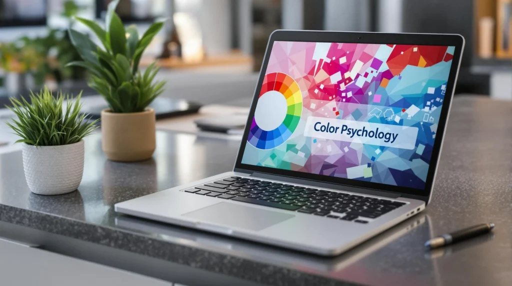
Understanding Color Psychology
Color psychology delves into the profound ways colors can sway emotions and behaviors, especially in online environments. When you recognize these effects, you can harness them to transform your website into a powerful tool for engagement and influence.
Definition of Color Psychology
At its core, color psychology is the study of how colors affect human perception and behavior. It examines the emotional responses that colors evoke, shaping decisions and experiences. For instance, a vibrant red can ignite feelings of excitement or urgency, while a tranquil blue often promotes calmness and trust. This subtle yet powerful influence can steer a visitor’s journey, guiding them toward desired actions on your site, be it making a purchase or signing up for a newsletter.
Historical Context and Evolution
The roots of color psychology stretch back through the annals of history, intertwining with art, culture, and philosophy. Ancient civilizations understood that colors held meanings and could influence thought. For instance, ancient Egyptians associated blue with divinity and protection, while the Greeks delved into the emotional implications of colors in their artistic expressions. Fast forward to the modern era, and the study of color expanded into psychology and marketing, revealing that colors can evoke specific feelings, affect mood, and drive behavior.
In contemporary website design, this knowledge has evolved into a strategic tool. Designers now utilize color palettes not just for aesthetics but as a critical aspect of branding and user experience. For example, brands like Coca-Cola and Facebook have mastered the art of color use, leveraging red to stimulate appetite and blue to foster trust. By embracing this historical understanding and continuous evolution of color psychology, you can mold your website to resonate with your visitors’ emotions, thereby optimizing engagement and enhancing overall effectiveness.
The Impact of Color on Emotions
Colors wield a remarkable power over our emotions and mental state, shaping your perception of a website within seconds. By harnessing this power, you can significantly influence visitor engagement and drive conversions.
Warm Colors and Their Effects
Warm colors, such as red, orange, and yellow, burst with energy and vibrancy. These hues evoke feelings of excitement, passion, and warmth, creating an inviting atmosphere that draws people in. Imagine walking into a cozy café adorned with rich reds and sunny yellows; it effortlessly exudes friendliness and enthusiasm. On websites, warm colors can stimulate action—red buttons often encourage clicks due to their eye-catching nature. However, moderation is where it’s at. Too much warmth can overwhelm or even irritate visitors, detracting from the experience you aim to create.
-Omar Hamid, Telecom professional and founder at Cliq Mobile
Cool Colors and Their Effects
In contrast, cool colors like blue, green, and purple offer a serene oasis. These colors provide a calming effect, promoting feelings of trust, stability, and relaxation. When you land on a website painted in soft blues, it’s like stepping into a tranquil garden after a hectic day; you can breathe easier right away. Brands that prioritize trust, such as banks or healthcare providers, often lean towards these soothing shades to establish reliability. Yet, while cool colors enhance calmness, it’s key to strike a balance. An excessive use of these colors may lead to a disengaging or overly sterile environment, leaving your audience feeling cold and disconnected.
-Melissa Copeland, Owner, YG Studios
Neutral Colors and Their Effects
Neutral colors—think shades of gray, beige, and white—exude elegance and simplicity. These tones act as a blank canvas, allowing other colors to shine while maintaining a sophisticated vibe. You might think of a sleek minimalist website featuring crisp whites and subtle grays; such palettes can evoke feelings of professionalism and clarity. Neutral colors are versatile and can complement both warm and cool tones, serving as the glue that binds a website’s design elements together. However, relying solely on neutral shades might render a site bland and unmemorable. You must strategically use them to create a harmonious balance that engages and retains your visitors’ attention.
-Paul Bowley, CEO at Abbeycare Group
Color Choices in Web Design
Choosing the right colors in web design is not just a matter of aesthetics; it plays a monumental role in shaping the user’s journey. Colors have the power to evoke emotions push decisions and craft a memorable experience. This section delves into how you can utilize color effectively to enhance your website’s appeal and functionality.
Importance of Color in Branding
The colors you select for your website are a reflection of your brand’s identity. Just like a crest represents a family or organization, your website’s color palette can signify your values, mission, and personality. For instance, think of the vibrant red of Coca-Cola which exudes energy and excitement versus the calming blue of Facebook which promotes trust and connection. By selecting colors that resonate with your target audience you are sending a message—even before they read a single word. This alignment between color choice and brand essence is key as it establishes recognition and fosters loyalty.
Color Schemes and Their Meanings
Color schemes are like the threads that weave together the tapestry of your website’s narrative. Each hue carries its own connotations and potential impact.
| Color | Meaning | Best Uses |
|---|---|---|
| Red | Excitement passion | Call-to-action buttons offers |
| Orange | Energy creativity | Promotions playful sites |
| Yellow | Optimism friendliness | Highlights child-focused brands |
| Green | Peace harmony | Nature health-related products |
| Blue | Trust reliability | Corporate sites financial services |
| Purple | Luxury spirituality | High-end brands creative endeavors |
| Black | Sophistication authority | Luxury brands designer portfolios |
| White | Simplicity cleanliness | Minimalist designs modern aesthetics |
Utilizing these color meanings allows you to tell a story and guide users through their journey. For example you might want to use warm hues to create an inviting atmosphere for a family-oriented site while employing cool tones for a corporate website to instill confidence.
Accessibility Considerations
When you select colors it’s imperative to consider accessibility. Imagine a visually impaired person trying to navigate your site—the experience can be drastically hindered without proper contrast. Aim for color combinations that are not only appealing but also user-friendly. Tools like contrast checkers can help ensure readability for everyone.
Using color blindness simulators can also offer insight into how your color choices may appear to individuals with color vision deficiency. By incorporating diverse color palettes that remain distinct for various users you not only enhance inclusivity but show that you care about your audience.
In conclusion understanding the nuances of color choices in web design empowers you to create a harmonious environment that resonates with visitors draws them in and encourages interaction. This thoughtful approach can significantly enhance user experience making your website not just another page on the internet but a destination.
Case Studies
Examining real-world applications of color psychology reveals powerful insights into how your design choices can make or break user engagement. Successful brands showcase the art of color, while others fall flat due to poor color decisions.
Successful Examples of Color Usage
Take a moment to ponder how McDonald’s masterful use of red and yellow encapsulates the spirit of fun and excitement. These warm colors stimulate appetite and energize visitors, making them feel welcomed and eager to engage. Another superb case is Spotify, which employs striking green in its branding to evoke feelings of freshness and creativity. This choice sets the perfect backdrop for users to explore new music and playlists passionately. Similarly, LinkedIn’s professional blue resonates with stability and trust, ensuring that users feel confident networking on their platform. Each of these brands demonstrates how selecting the right color palette aligns with their core message, creating an emotional bond with their audience.
Failed Color Choices in Web Design
Conversely, the tech world isn’t without its mishaps in color selection. Consider the infamous redesign of a website that opted for a neon color scheme, which left users feeling like they had stumbled into a digital circus. Overly bright and clashing colors can overwhelm the senses, leading to website abandonment faster than a deer in headlights. Another example is a non-profit organization that chose an all-black background adorned with bright red text. While aiming for urgency, they inadvertently created a website that felt more like an emergency alert than an inviting space for contributors to feel good about supporting their cause. These blunders serve as cautionary tales, illustrating how color can influence user perception—in this case, leading them away rather than engaging them.
Analyzing these examples of both triumph and failure underscores the necessity for thoughtful color choices in web design. When done correctly, colors can orchestrate an inviting atmosphere that captivates and retains visitors, transforming a simple web page into a symphony of emotion and connection.
Performance and User Experience
The colors on your website are more than mere decoration; they are powerful tools that shape the experiences of your visitors. By strategically integrating color psychology, you can influence user behavior and create a memorable interaction.
How Colors Affect Visitor Behavior
Colors act as silent guides on your website. They can evoke feelings that push visitors toward making decisions. For instance, the vibrant thrill of red can ignite a sense of urgency, compelling users to act quickly. Imagine the excitement of a red “Buy Now” button; it practically pulses with energy, beckoning users to click. Conversely, a soft blue can gently instill trust and calmness, allowing potential customers to explore more freely. When paired thoughtfully, colors can weave a narrative, leading your visitors on a journey that feels seamless and intentional. Each hue tells a different chapter, shaping how you want them to perceive your brand and products.
Influence on Conversion Rates
Your choice of colors can make or break conversion rates. Think of colors as persuasive agents; a well-crafted palette can encourage users to take action. Research shows that consistent use of effective colors can boost recognition and memorability. Imagine the classic combination of yellow and black—think of a certain brand of sportswear—this pairing stands out glaringly and creates an undeniable visual impact. More than just eye-catching, these colors imply energy and intensity, driving conversions by capturing attention.
On the flip side, a discordant color scheme may confuse or even repel visitors. For example, a website flaunting overly bright colors with no coherence could leave users feeling overwhelmed and disoriented. Just as a cacophony can overshadow a beautiful melody, an unharmonious design can drown out your message, leading to abandonment rather than action. A/B testing color schemes can be your compass, allowing you to discern which combinations resonate best with your audience, ultimately enhancing your sales and engagement metrics.
Thoughtfully choosing and combining colors can revolutionize your website’s performance and user experience. When colors are aligned with your messaging and brand identity, they lead visitors down a path of connection and conversion.
Comparison with Other Design Elements
When considering website design, it’s vital to evaluate how color interacts with other elements like typography and layout. These components work synergistically to shape the visitor’s experience, ensuring that every aspect of the design sings in harmony.
Color vs. Typography
Color and typography are like dance partners on a website, each enhancing the other’s strengths. Typography refers to the style and arrangement of text, which plays a major role in readability and user engagement. Think about how a bold red headline can demand attention while a soft blue subheading can guide the reader’s eye. If your text is legible yet lacks visual appeal, visitors might lose interest quickly.
Imagine choosing a vibrant orange for warning messages presented in sleek, modern typefaces. The contrast captures attention, conveying urgency effectively. Conversely, pairing a calm pastel color with serif fonts can evoke a sense of warmth and approachability. You should also consider hierarchy; lighter hues may fade into the background, making it difficult for vital information to stand out. Thus, a well-thought-out relationship between color and typography not only enhances aesthetic appeal but also fosters clarity and improves user experience.
Color vs. Layout
The interplay between color and layout is akin to the relationship between a canvas and paint. A thoughtfully designed layout organizes content, guiding users through journeys on your site. Color amplifies this experience, directing focus to essential elements like calls to action and navigation menus.
Imagine a layout that uses spacious white areas with striking blue buttons. This setup not only makes navigation intuitive but also encourages action, as the blue often inspires trust and calmness—a perfect combination for e-commerce sites. On the other hand, a cluttered design with clashing colors can overwhelm visitors. If the palette resembles a chaotic rainbow, the overall message becomes muddled and can drive users away.
In addition, contrasting colors used strategically within the layout can convey importance and urgency, compelling users to pay attention. For example, a vibrant red banner atop a organized layout can announce special offers, compelling visitors to act quickly. To achieve the right balance, you must consider how color and layout unify to create an engaging and pleasant experience for your audience.
Conclusion
Harnessing the power of color psychology can transform your website into a captivating space that resonates with your audience. By selecting colors that align with your brand’s message and evoke the desired emotions, you can significantly enhance user engagement and drive conversions.
Remember to consider accessibility to ensure all visitors can enjoy a seamless experience. A thoughtful approach to color choices not only reflects your brand identity but also guides users on their journey.
With the right palette and design elements, you can create an inviting atmosphere that keeps visitors coming back. Embrace color psychology and watch your website flourish.